
|
Title: Pathway to Home
|
Inspiration:
|
Duachaka Her:
Duachaka Her is a Cartoonist and illustrator who depicts Hmong stories and the struggles of being Hmong American throughout her illustrations. The pieces are inspired through her own experiences, and uses art to express who the Hmong are. In the piece, Foreign Land, it depicts Hmong landscape. Using barren land and sharp lines to have emphasis on the emptiness, and uses lighter tones in the background to add depth. In addition, this high contrast alludes to the loss of the Hmong landscape. Furthermore, this is emphasized through Her’s yellow monochromatic color palette, which evokes a plan landscape to give the moods of peacefulness and warm tones. In my own work, I wanted to implement this contrast, and use of texture to create depth. This is to illustrate my own desire to showcase the beauty in the Hmong culture. Also, show amidst the strictness in culture, there is a beauty of a sense of community. |
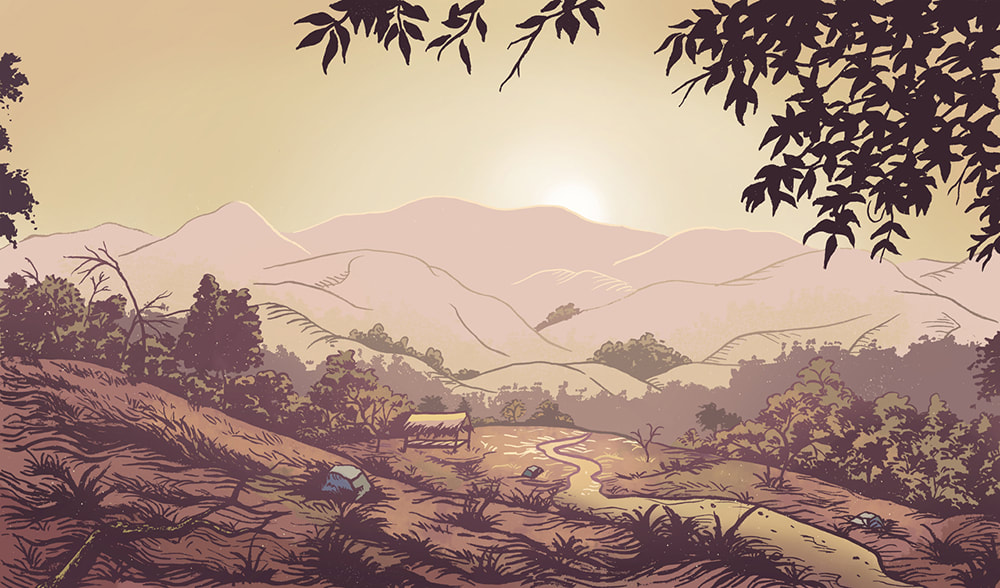
Foreign Land by Duachaka Her.
|
Planning Sketches:
Throughout the planning I tried to see what plants I wanted, searching the different plants that are in Laos, the styles of how different buildings, person, and the place is made, and textures I wanted. I also sketch the different colors to what I'm going to use and how I'm going to use, and pick what blended colors I need to create a scene that pops out. Then, I figured I what color sky due to yellow having more of a happy tone and depth. Moreover, trying to find what position I want the main figure to be in, and trying to implement how the Hmong clothing is worn and what folds are needed to create a similar look and add depth.


Process:
|
|
Throughout the process I firstly applied a light sketch of where I wanted everything and the placement of the foreground, background, and midground. Then I lightly shaded the undertones of the colors and then the main color to blend it out. Afterwards, I started adding layers to get a more vibrant look, and added a brown or a complementary color to the main color to create a darker hue of the color. Later, using the yellow as a highlight to create a happy tone and to create depth into the artwork. After I got all the shades and highlights in I went back in the original color tone, and blended everything out to give variance, while i kept the rough blending textures in other areas. Lastly, not fully blending out the grass to create depth into the grass.
|


Experimentation:
|
I had difficulty blending the darker browns with the green . Additionally, getting a darker green color, which I tried to blend with a brown, then blue, and red to give out a darker tone green due to the colors being darker or complementary to get the green hue to a darker shade due to the black colored pencil not giving the right hue I wanted for the background. Another thing I had to change is the texture of the field in the background, due to being too detailed, I later just blended the yellow out with reds and greens to complement the field to pop out, additionally, changing the brown to a more burnt sienna to create more contrast to have the focus on the roads and figure better.
|

|

|
Another thing I had experimented on was what colors are needed to compliment and contrast from the green, due wanting the piece to show the different pathways and contrast from the piece having majority of the green. At first I went in with a brown color, then seeing that the piece wasn't really contrasting apart from the green, I added a red undertone and added burnt sienna to give a more complementary look to all the green surrounding. Additionally, finding out that going into the opposite direction also helps blend out the colors, trying to blend out colors in the background and foreground.
|
Reflection:
Overall, I enjoyed doing the project, With the main part I've struggle with is creating the different layers due to either not applying the colors harder due to the hardness of the colors not applied on, and not blending the colors enough to give the depth. I would of done the layering with less pressure in some areas due to being too waxy to blend out some parts of the area, In addition I would had work on the sketch more to give a more polished look due to some areas not being proportionate to where they are placed. What I am going to continue to use is the use of hues to create depth, and applying from light to darker shades, as well as, the different use of line strokes to blend out the colors more thorough.
Compare & Contrast:

Contrast:
- Foreign Lands, has a more contrast by using different hues and layering to create depth, while in Pathway to Home, has more textures, and blending to give depth in some areas due to layering of the same colors wouldn't give much depth from the medium. - Pathway to Home's theme and concept is different due to showing the beauty of the past through vibrant hues and tones, while Foreign Lands contains duller hues and textures illustrate the Hmong having to flee from their homeland. - Foreign Lands utilizes empty space and blended or even textures to illustrate the sorrow from the Hmong fleeing their homes, however, in Pathway to Home deals with more textures and space to illustrate the peace of one's Hmong identity, and show the rich beauty that the culture has. - Pathway to Home intent was therapeutic and expressive of the beauty if the Hmong Culture, and having peace from seeing the beauty, while, Foreign Lands purpose was expressive to showcase the sorrow that the Hmong had of losing their homeland. |

Compare:
-Both have variety of textures to create depth in the art from the foreground to the background. - Both uses complementary colors to green to differentiate the main subject apart from the landscape. - Having a sense of movement by how each line was created to move the eye. - Use of shades to add depth to the piece, by darker shades placed in the background and midground to differentiate from the foreground. - Try to implement scenery into the themes, and uses brighter colors to create a theme of a landscape to create beauty. |
ACT Questions:
1) Clearly explain and describe how you are able to identify the cause-effect relationships between your inspiration and its effect upon your artwork.
I was able to identify the cause and effect relationship between my inspiration in my artwork by using the same textures and inspired by the use of depth from the placement of the objects in the inspiration piece.
2) What is the overall approach (point of view) the author (from your research) has regarding the topic of your inspiration?
The overall approach the author has regarding the topic of creating art for it's look and trying to make a landscape with varying textures and depth, and use of textures to create depth and lines for movement in the piece.
3) What kind of generalizations and conclusions have you discovered about people, ideas, cultures, etc. while you researched your inspiration?
Generalizations and conclusions I've discovered about the culture is and the how Her's style formed from inspiration through Reiko Yoshida and mangas, In addition, the use of color and texture to create a somber, and serene mood to mean the missing of a home.
4) What was the central idea or theme around your inspirational research?
Themes around my inspirational research was around having the look of beauty and a landscape piece that had varying textures and placement in which it creates a story from the depth from the foreground to background.
5) What kind of inferences (conclusions reached on the basis of evidence and reasoning) did you make while reading your research?
Inferences that was that I make while researching was Her's use of textures and lines in illustration because her original piece was a digital piece, and mines is a colored pencil illustration. Using smooth blending to recreate similar textures. Also, Her's stylization from her sketches and process.
Bibliography:
“Duachaka Her.” Hmong Museum, 18 June 2020, https://hmongmuseummn.org/collection/artists/duachaka-her/.
“Illustration.” DUACHAKA HER, 26 Aug. 2021, https://duachakaher.com/illustration/#jp-carousel-4229.
“Illustration.” DUACHAKA HER, 26 Aug. 2021, https://duachakaher.com/illustration/#jp-carousel-4229.
