
|
Title: Block Building to the Sky
|
Artist Inspiration:

Winter on Fifth Avenue by Guy C. Wiggins
|
Painting Inspiration:
|
Photography Inspiration:
|

Rise Above Darkness by Angie McMonigal
|
Sketches:
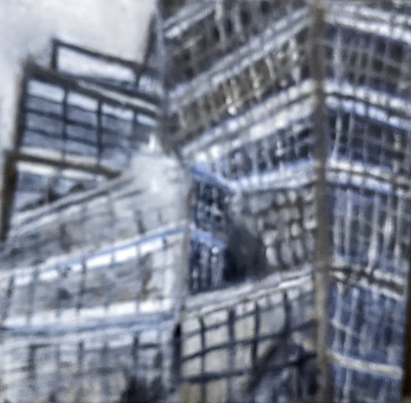
Firstly, I wanted to connect the concept of architecture and design into my painting and impressionism. Also, finding how to apply basic geometric shapes and finding artist who tend to do landscapes with architecture. Then I researched into Wiggins style, seeing that it could match my photography with the colors. Then I changed what color pallete would suit my painting inspiration of picking a color to fit the theme, with blue and white, to give off a mood of sadness from the cooler tones. Also, wanted the two colors to contrast to gravitate to the whites from that each window is a separate shape and form and the contrast of the shadows and highlights. Also, deciding what textures I want from the part of the photos, with the one with the reflection had the most complexity and tones in it from the other parts, and the texture isn't repetitive in a pattern. After finding what colors I wanted in the painting I created a chart of the colors I would need to blend and have to create the painting and having a base swatches to see what colors I would need.


Process: I blend out and create the first initial background and the first layer of the paint due to it being hard to paint over darker tones to have the highlights in the windows from the paint being less opaque, Then, I added layers of shaw's of the highlights and shadows and blending some shades to have smoother transition. I used a larger brush to apply more paint due to the large base and used it for blending out the colors, then using the smaller brush to add details in impressionism. After I added more blue to the black to get a darker shade and give off a mood of sadness from the darker tones and a blue undertone. Throughout the process I used long defined stroke with the white paint, often going back with the the brush in a rough motion to give texture and adding fine brush lines to add to the structure of the window frames, I applied more paint to create a more emphasis of the lines of each structure, then waiting for it to dry, then adding layers and brush lines to create texture. Then after the paint dried, I added the last highlight layer and added highlight to the windows, with more paint to water ratio to create a textured look as a window.
|
|


Experimentation:
|
Throughout the process I had to experiment due to the initial layer behind the window frames having different shades, so building the base color. With that each pane had different shades and highlights I had to add some brown due to the black not being a true black and having keep changing and adding new highlights due to always blending out. I furthermore kept changing the paint mixture to get the dark blacks out to show. Additionally, I kept going back after painting the window panes and redo the structure and apply the highlight on the structure and glass. Additionally, experimenting on how to get the highlight in the window, trying to paint the frame after the base layer, then layering white or black paint after to create further emphasis to create a window look. Lastly problems with how dark the black was, due to the set not having a black, I had to mix the gray and the burnt amber to create a more darker shade of black to bring out the blues to create the sad mood that will be build up..

|
Another thing I had to experiment with is trying to blend out and add texture of the highlight onto the building, this was difficult due the water either blending the paint together, and the white not applying onto the canvas without blending it all the way out. Firstly I tried using less water and put paint directly onto the canvas and seeing how much water on the brush can affect the visibility of the paint onto the canvas. This was also a challenge due to having the crisp lines of the window structure, not being straight, trying to add more water due to the paint not thinning out enough, then I tried to go back with the black or white to create the texture of the smoothness of the windows. I also tried to put two straight edges of paper to create a crisp straight line but the paint feathered out, creating a faded textured line than a sharp thin line. WIth the varying textures creating a sense of different details building up the painting. Lastly, the paint, not being able to apply onto the canvas, either due to having too much water or the white paint not opaque enough, trying to redo the white layers after.
|


Reflection:
Overall, I learned that oil paints require more time to dry and layers cannot be applied after a day, and the different techniques and water to paint ratio to create a painting. This project, was difficult but fun to do, with many of the difficult parts I tried to solve. I will apply these skills into my future art of layering and creating a base coat first, and building in layers for other artworks. Also, seeing different color pallets that I could use by color theory by the artist using two complementary colors of warm tones to cool tones to create a better contrast in the artwork. Moreover, struggled with having to create a darker black dolor and trying apply the strokes more smoother due to more water on the initial background, feathering out the lines instead of getting the smooth textures. Additionally, building from darks to lights from some mediums opaque enough to do so. If I would to try this project again I would try to paint the color of the window frames first then the window due to creating more complexity and texture than having the window painted first. Also with my initial theme, changing and continuing into that small details build up to make building to seem as it's rise, with painting somewhat diminishing the intent due to playing more with the textures and rectangular shapes than the perspective of the skyscrapers.
Compare & Contrast:
Compare:- Both have contrasting hues, due to the warm tones of browns in the windows and building structure, and cool tones of the building and the sky.
- Varying textures from the brush techniques of blending and applying more paint and layers to create texture. - Both have a cold feeling to the painting, this is created by both paintings having a blue undertone in the colors and mostly having cooler tones of greens purples and blues. - asymmetrical, by a longer part of the building on one side and on the other blank empty space or a tall building. - Depth, by both having different layers and a focus on the foreground, background, and midground of each section of a building. |

Contrast: - They contrast by the theme of Block building to the Sky about the fine details to create a larger image, and Winter on Fifth Avenue about the snow and showing that it can illuminate and cause the reader to think differently from the city being rushed.
- Block Building to the Sky uses contrasting colors of blue and white to create contrast from dark to light while, Winter on Fifth Avenue uses complementary colors of yellow or orange, and greens and blues to create contrast. - In Block Building to the Sky has more a geometric look than in Winter on Fifth Avenue, because it deals more in a scene while Block Building to the Sky deals with textures. - In Block Building to the Sky, the canvas shape is in a square shape to show more in a piece within a piece, while in Winter on Fifth Avenue uses a portrait view in the painting to create more depth in the streets. - Block Building to the Sky having more blended textures due to the windows and wanting to show each window having a different texture from the photography, while in, Winter on Fifth Avenue has more varied textures due to majority of the textures from the different brush lines used to represent snow, buildings, and people. |
ACT Questions:
1) Clearly explain and describe how you are able to identify the cause-effect relationships between your inspiration and its effect upon your artwork.
I was able to identify the cause and the effect relationship between my inspiration and its effect on my artwork by the color pallete, and the usage of white paints creating texture and the highlights, also the brush strokes, some parts reflecting the strokes.
2) What is the overall approach (point of view) the author (from your research) has regarding the topic of your inspiration?
The overall approach regarding the author has topic of my inspiration by the different techniques to create texture and play with the various brush strokes and various lines to create a sense of movement in the artwork from the textures.
3) What kind of generalizations and conclusions have you discovered about people, ideas, cultures, etc. while you researched your inspiration?
Generalizations and conclusions I have discovered about ideas and cultures while researching my inspiration is the culture at the time by paintings expressing about the looks and using color to create a scene and the brush techniques based off of the paintings in the style.
4) What was the central idea or theme around your inspirational research?
The theme around my inspirational research is mainly about the moods color can convey by using the landscape of manhattan and streets in the snow, creating a more busy and that the world is lit up by the tones of whites and yellows being bright.
5) What kind of inferences (conclusions reached on the basis of evidence and reasoning) did you make while reading your research?
Inferences I made while reading my research was about mainly drawing architecture due to going into school in architecture and having awards in design and forms in his paintings.
Bibilography:
“About/Contact.” Angie McMonigal Photography, 17 Sept. 2020, www.angiemcmonigal.com/site_v2/aboutme/.
Catalogue Raisonne´. (n.d.). Retrieved November 10, 2020, from http://www.guycwiggins.com/bio.html
Guy Carleton Wiggins, NA (1883 - 1962): Artist: Macconnal-Mason. (n.d.). Retrieved November 10, 2020, from https://www.macconnal-mason.com/artist-detail/240408/guy-carleton-wiggins-na
Catalogue Raisonne´. (n.d.). Retrieved November 10, 2020, from http://www.guycwiggins.com/bio.html
Guy Carleton Wiggins, NA (1883 - 1962): Artist: Macconnal-Mason. (n.d.). Retrieved November 10, 2020, from https://www.macconnal-mason.com/artist-detail/240408/guy-carleton-wiggins-na
